The Brief:
A van rental company with a sense of adventure! They required a logo, merch design and social media package.

My idea:
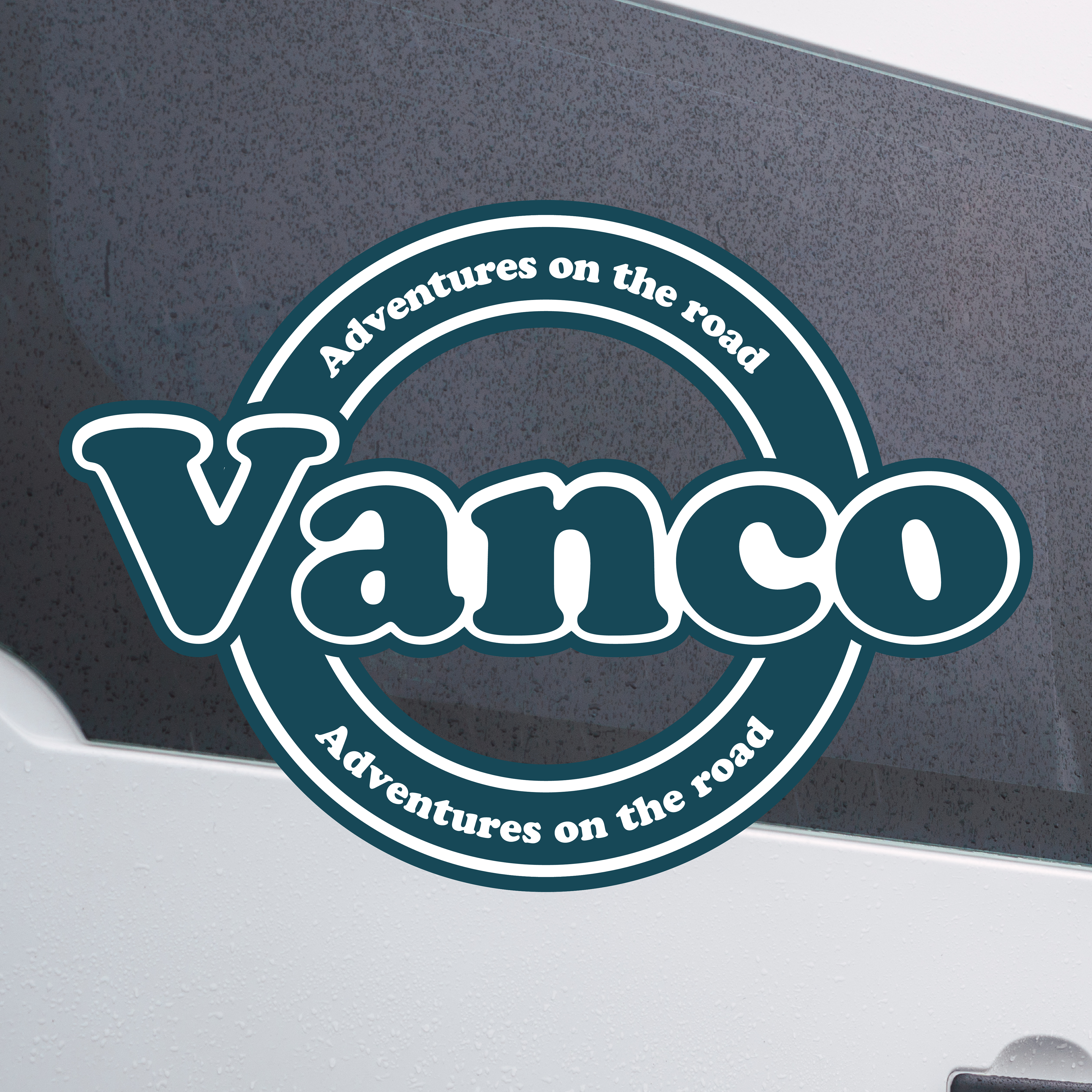
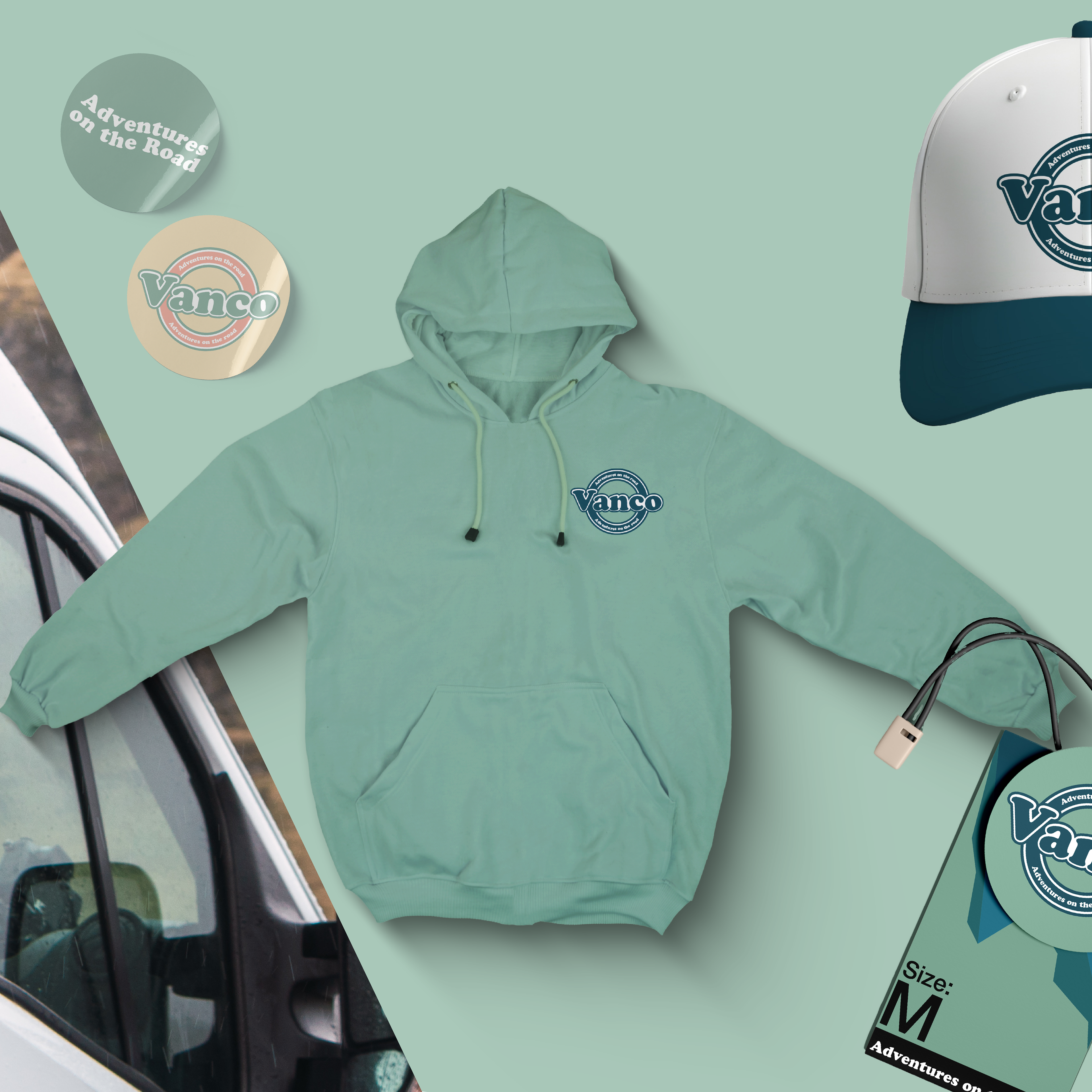
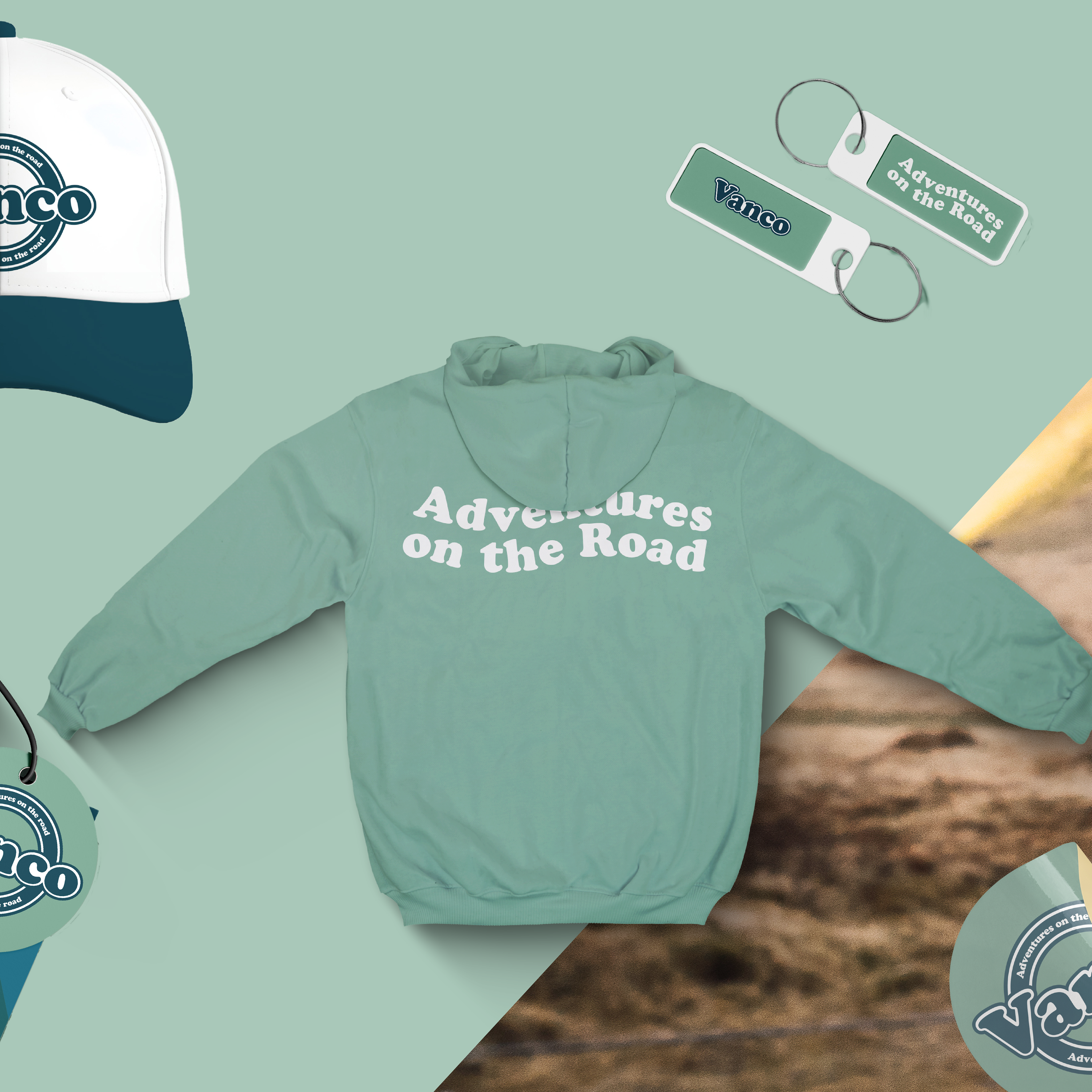
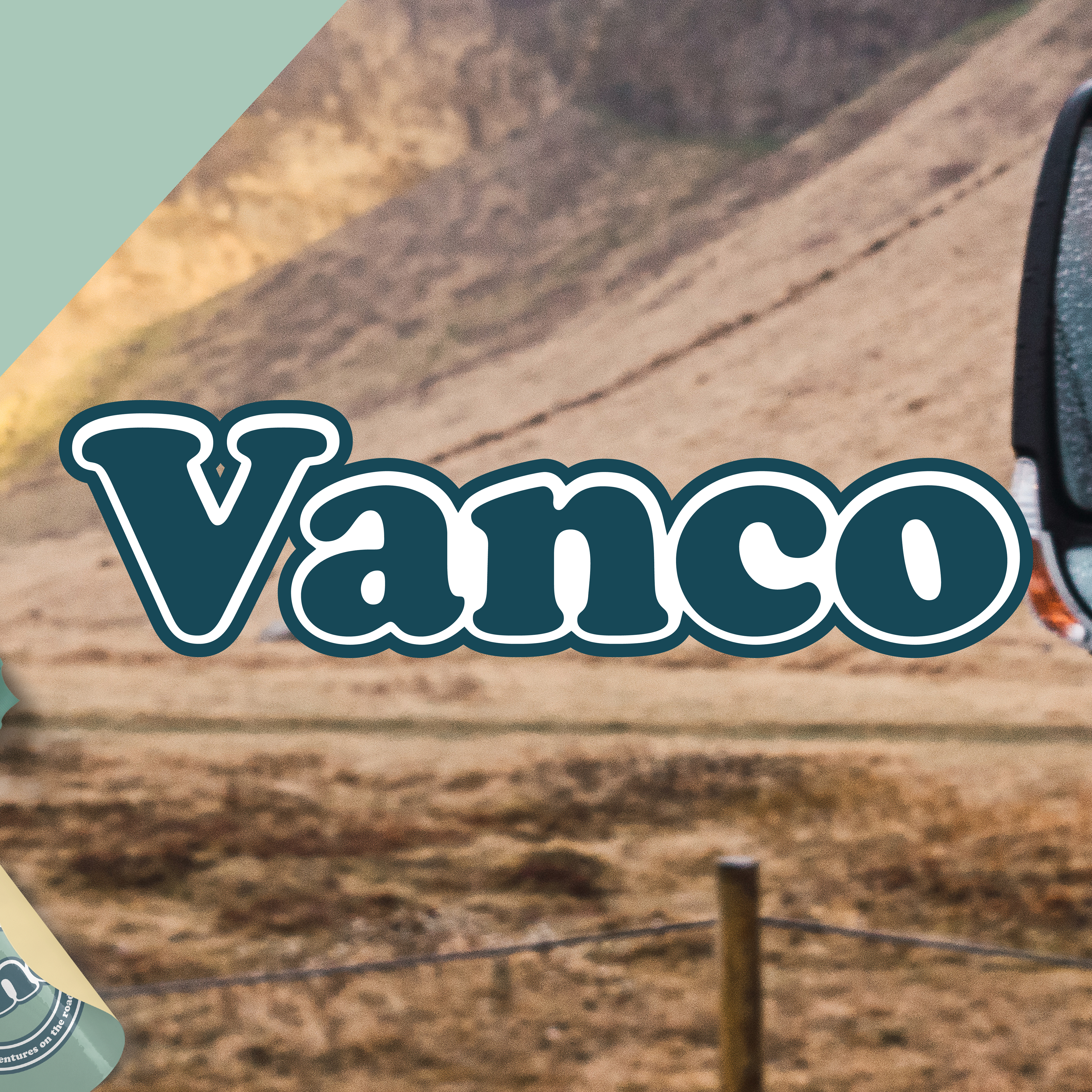
I wanted to capture the sense of adventure and use that to separate it from the corporate aesthetic of other van rental competitors. I chose to show this adventurous side through using shades of green to denote nature, conjuring up images of mountains and fields. The circular shape of the logo was to slightly hint towards the shape of a tire, to subtly suggest the nature of the business. I used the font ‘cooper’ to also help break away from a purely corporate identity and to show a sense of fun as this font was bubbly and retro inspired, also hinting at travelling perhaps to old towns and seeing these old signs using similar fonts.
I wanted to capture the sense of adventure and use that to separate it from the corporate aesthetic of other van rental competitors. I chose to show this adventurous side through using shades of green to denote nature, conjuring up images of mountains and fields. The circular shape of the logo was to slightly hint towards the shape of a tire, to subtly suggest the nature of the business. I used the font ‘cooper’ to also help break away from a purely corporate identity and to show a sense of fun as this font was bubbly and retro inspired, also hinting at travelling perhaps to old towns and seeing these old signs using similar fonts.