The Brief:
A large company is switching to solar energy. Before
gas was sold now only green energy via solar energy.
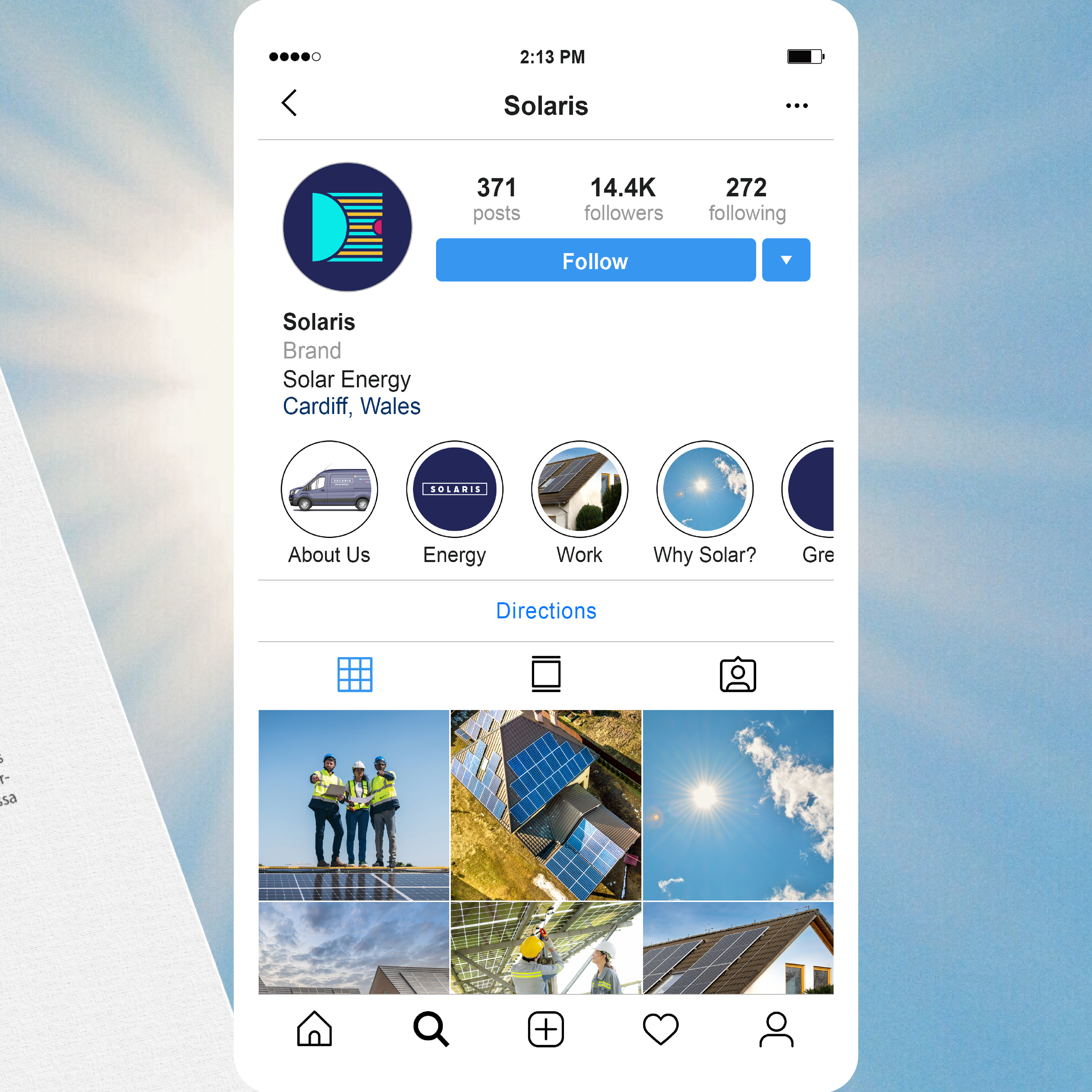
The company needs a new brand identity with logos
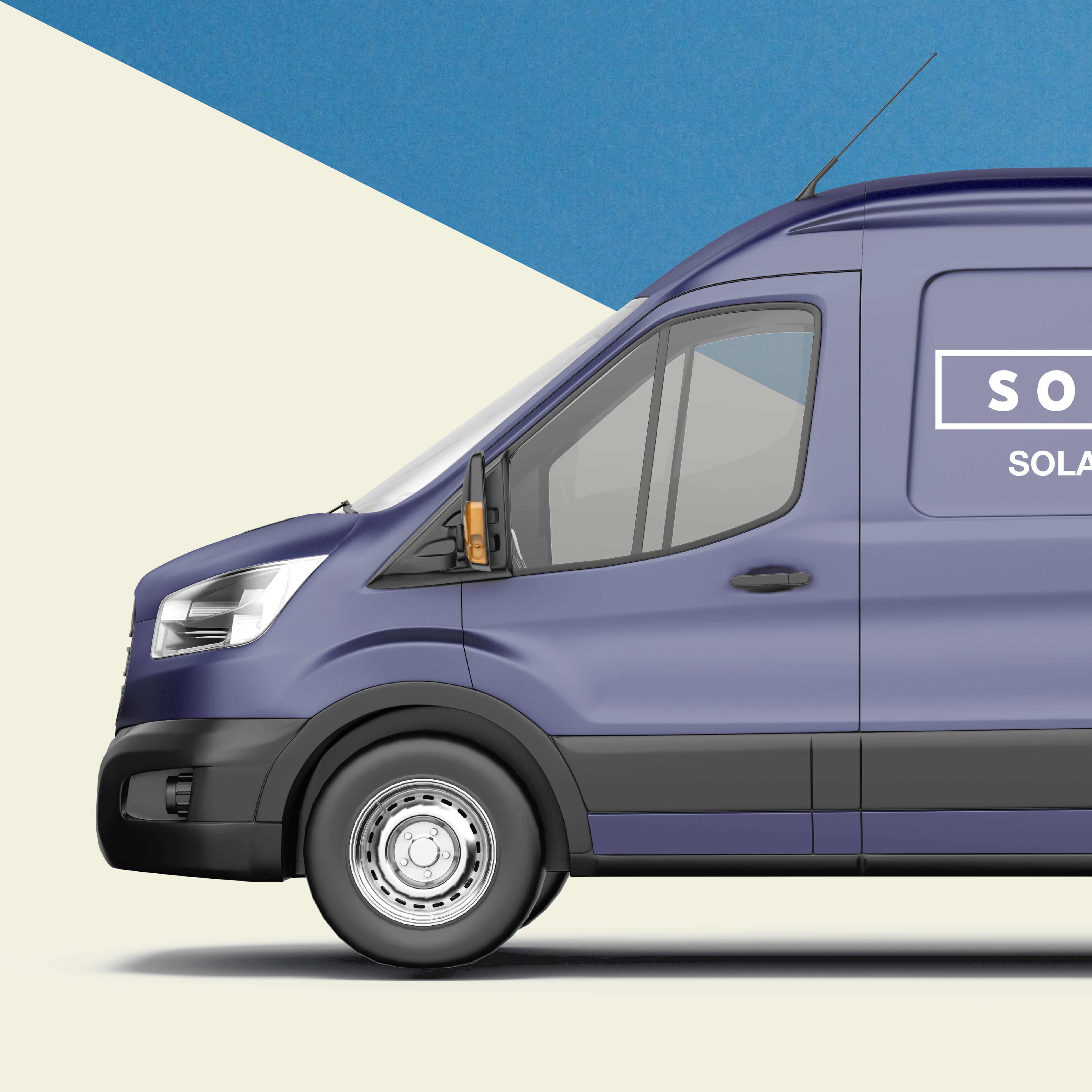
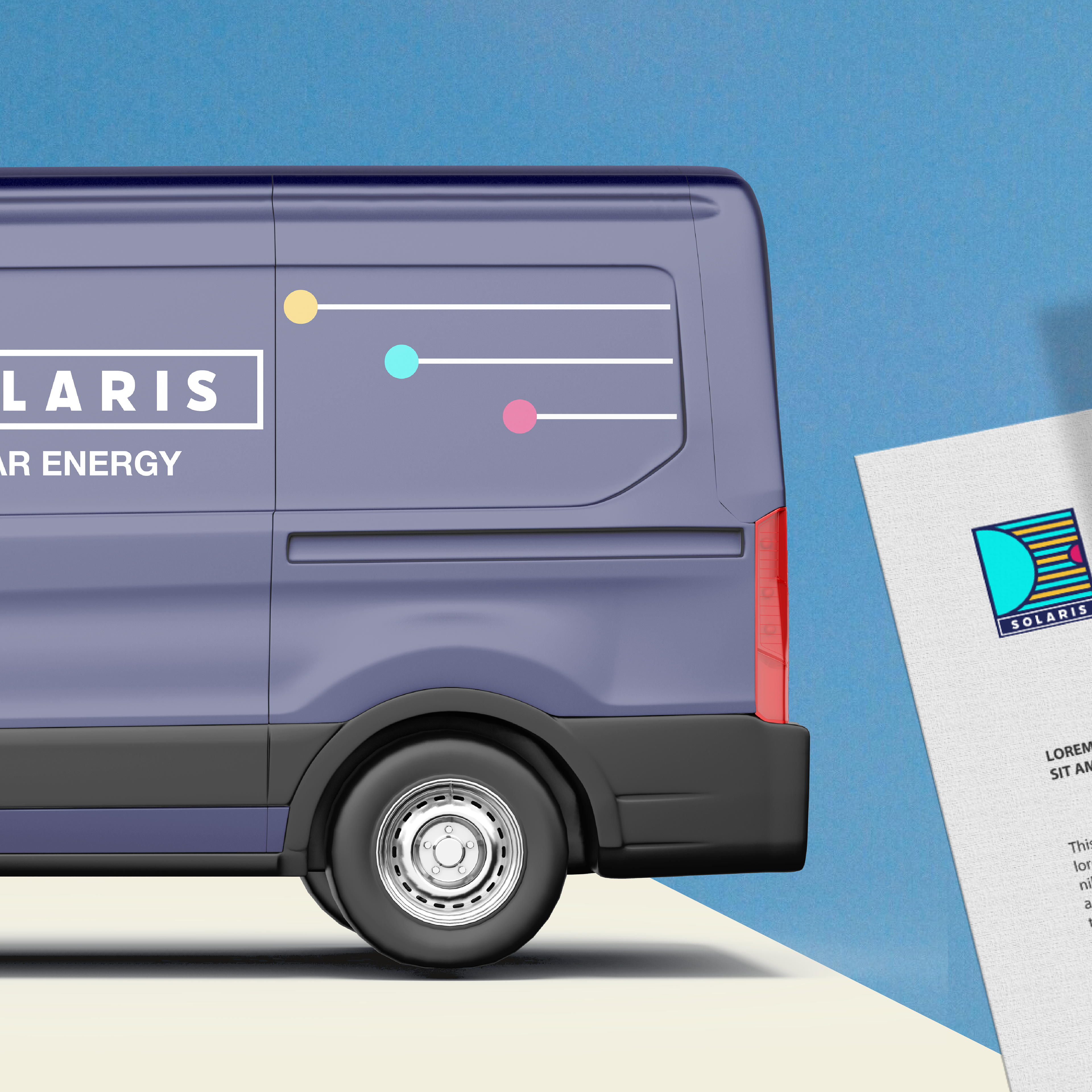
in different versions for advertising, social media,
vehicles.

My idea:
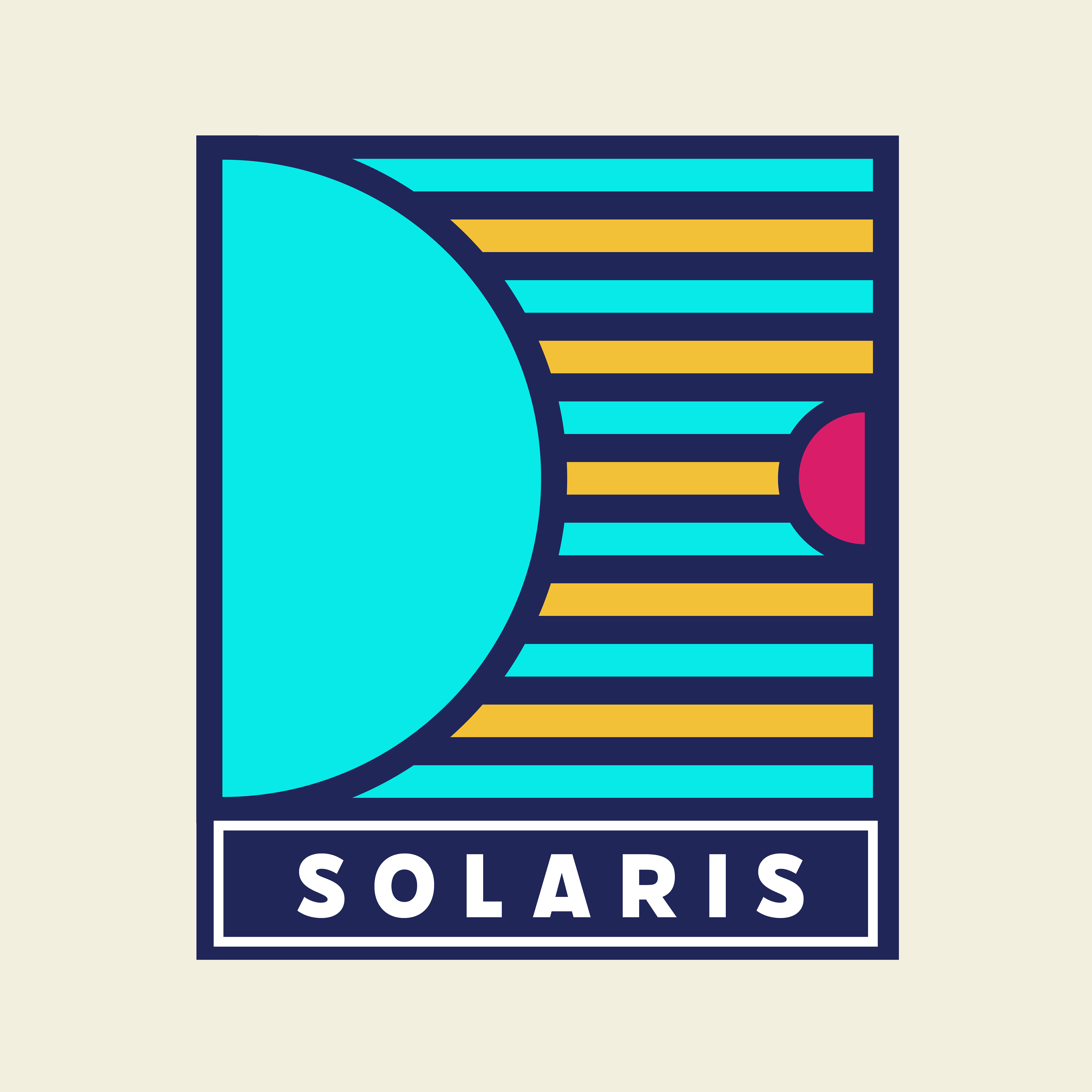
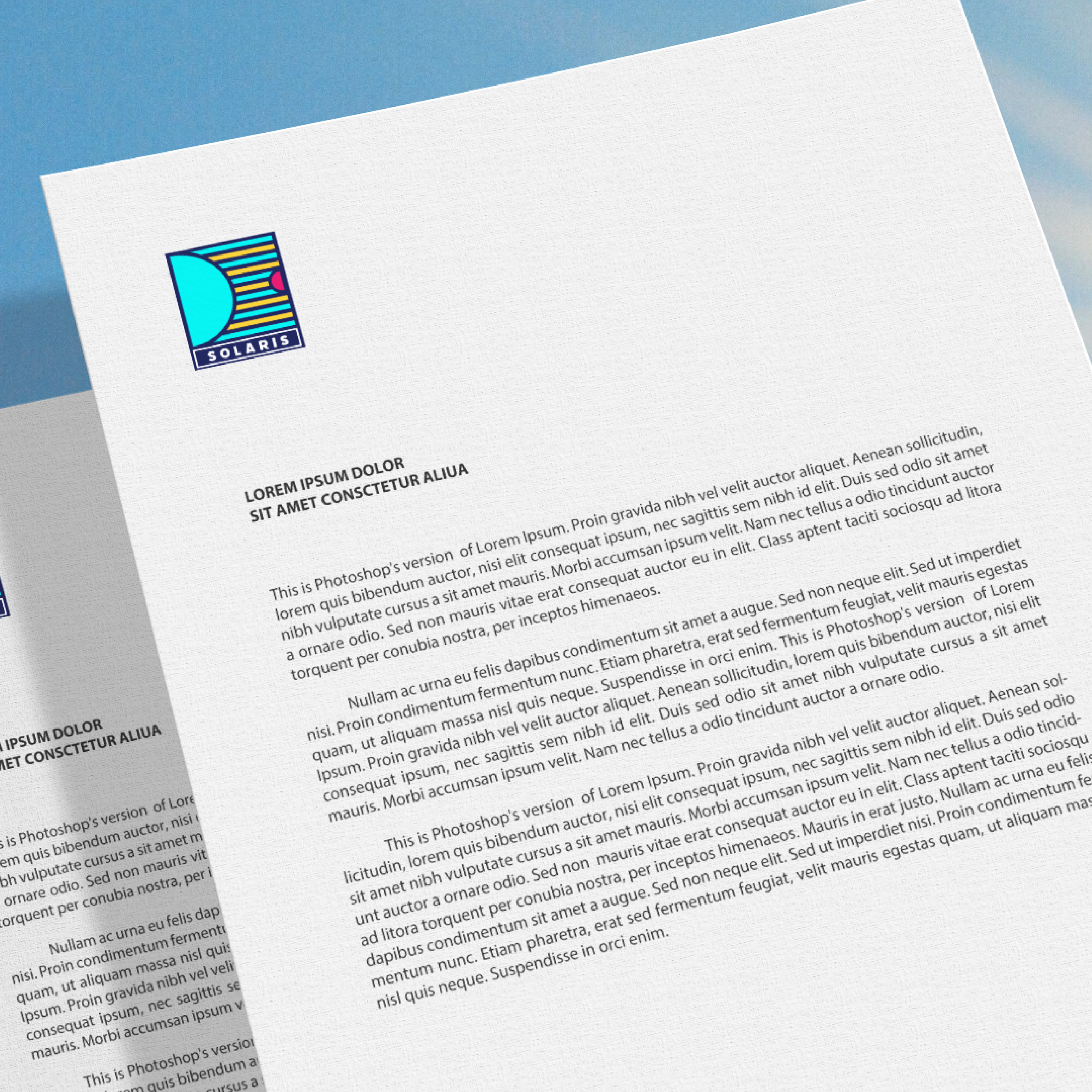
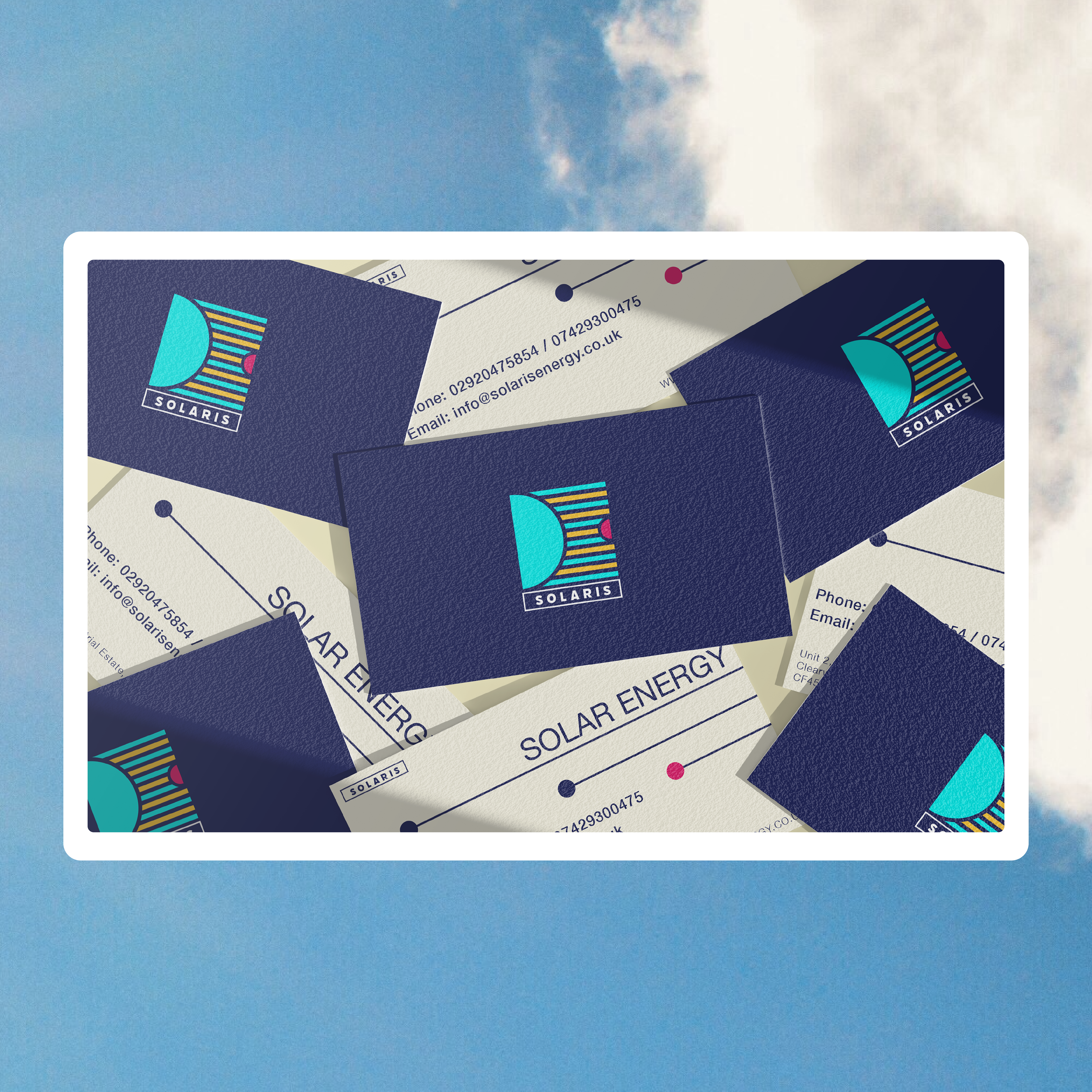
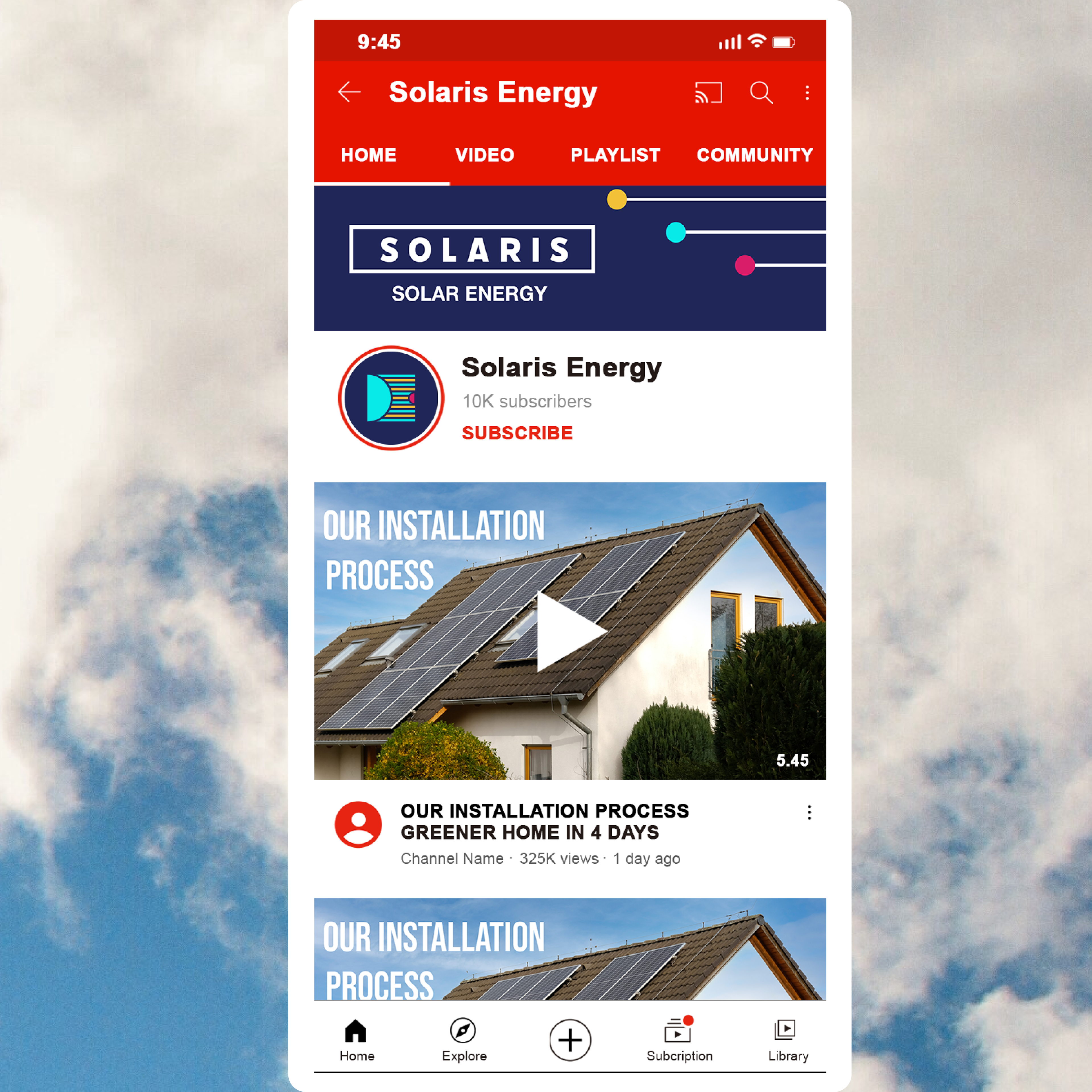
I knew the logo had to be more corporate and work across multiple areas but I also wanted it to have an element of attractiveness to it, as corporate logos seem boring, lifeless and don’t always tell you what you’re getting. My Solaris logo and variations were inspired by the rotations of planets around the sun and the rays of sunlight reaching them. In the main logo, I depict the sun, its rays and a planet that’s meant to represent earth. However I didn’t want the colours to only represent the sun and earth, I wanted them to represent clean and efficient energy. Therefore, I chose yellow to represent solar energy, blue for clean and efficient energy, the white and pink were chosen to provide contrast and draw attention and the the darker blue felt it gave a professional, corporate image.
I knew the logo had to be more corporate and work across multiple areas but I also wanted it to have an element of attractiveness to it, as corporate logos seem boring, lifeless and don’t always tell you what you’re getting. My Solaris logo and variations were inspired by the rotations of planets around the sun and the rays of sunlight reaching them. In the main logo, I depict the sun, its rays and a planet that’s meant to represent earth. However I didn’t want the colours to only represent the sun and earth, I wanted them to represent clean and efficient energy. Therefore, I chose yellow to represent solar energy, blue for clean and efficient energy, the white and pink were chosen to provide contrast and draw attention and the the darker blue felt it gave a professional, corporate image.