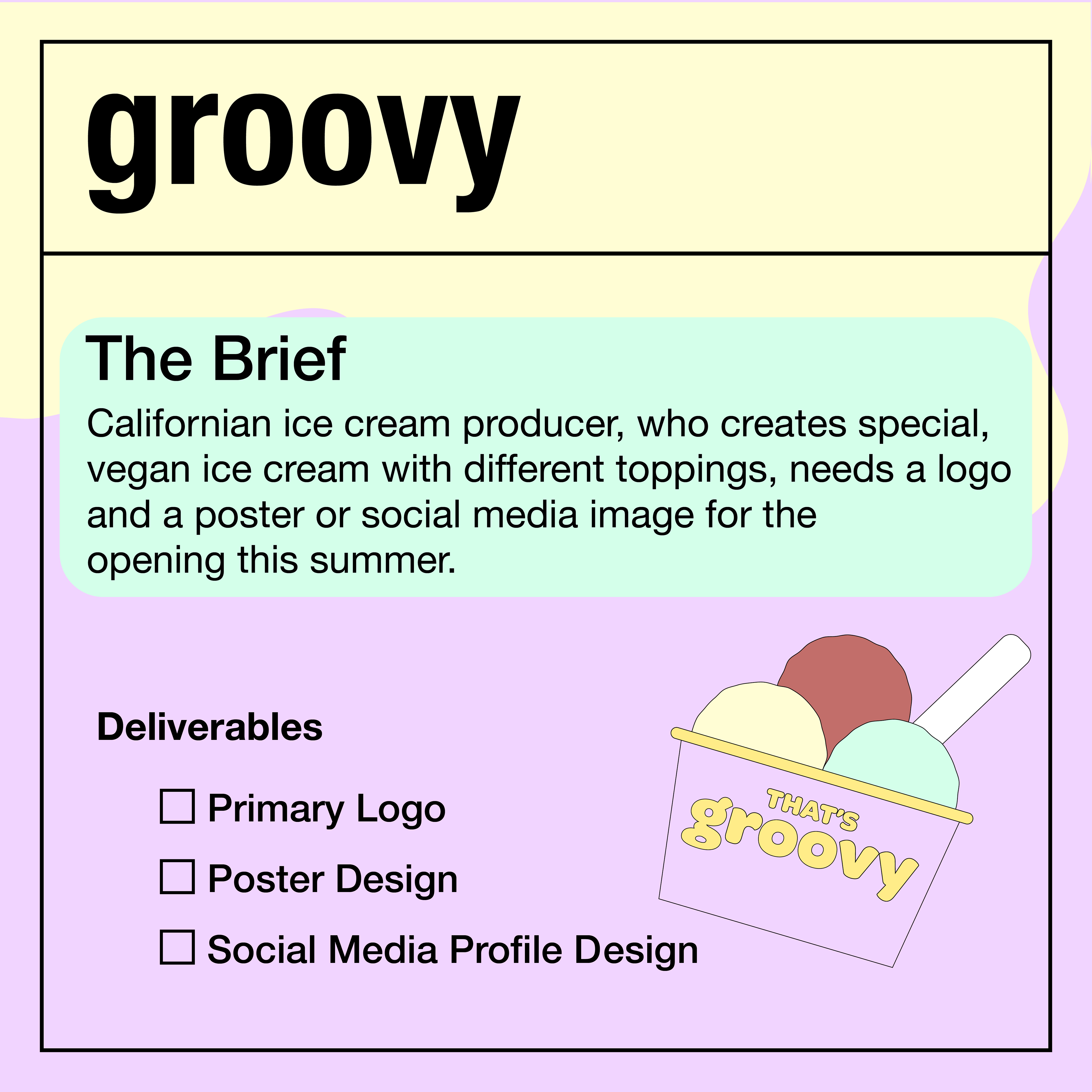
The Brief:
Californian ice cream producer, who creates special,
vegan ice cream with different toppings, needs a logo
and a poster or social media image for the
opening this summer.

My Idea:
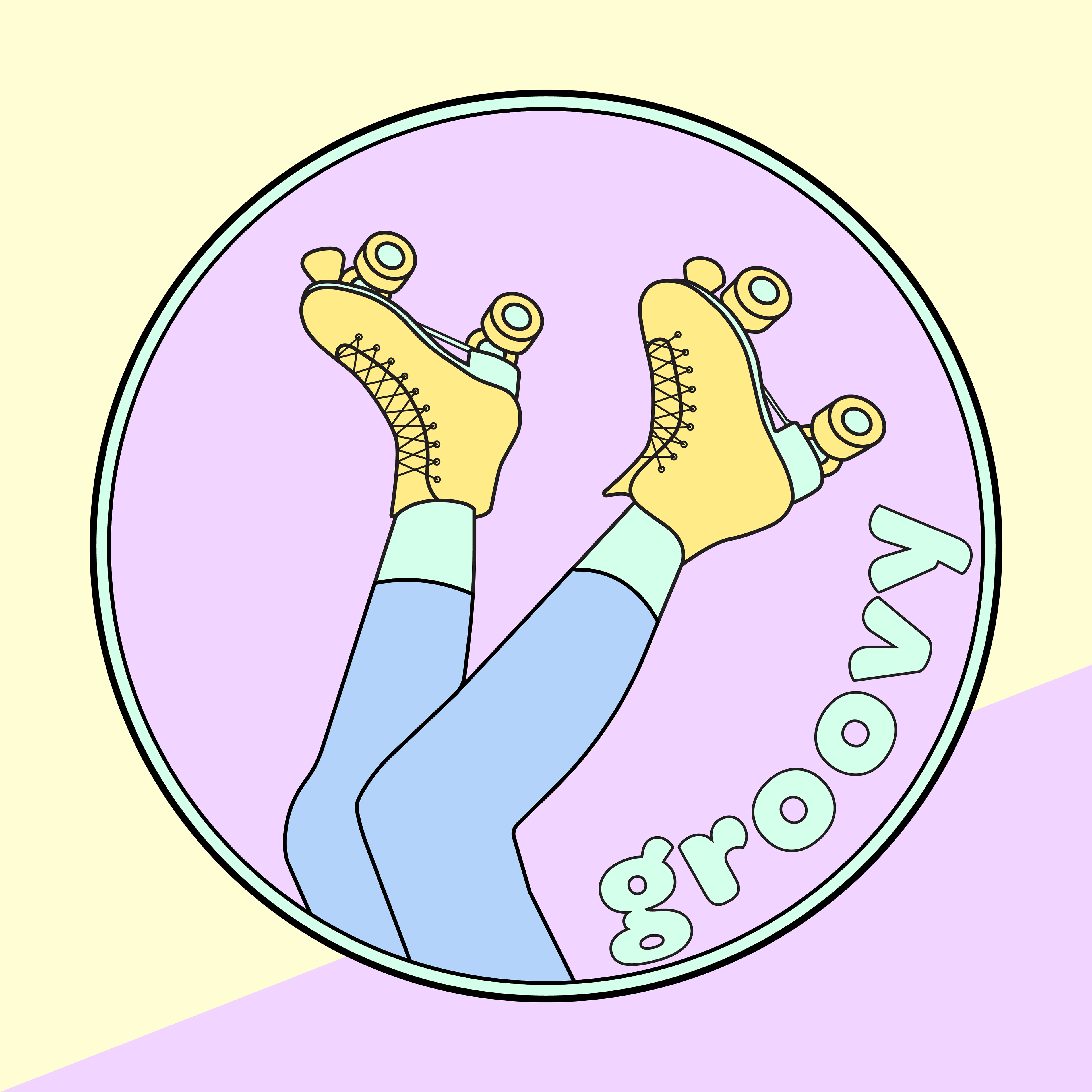
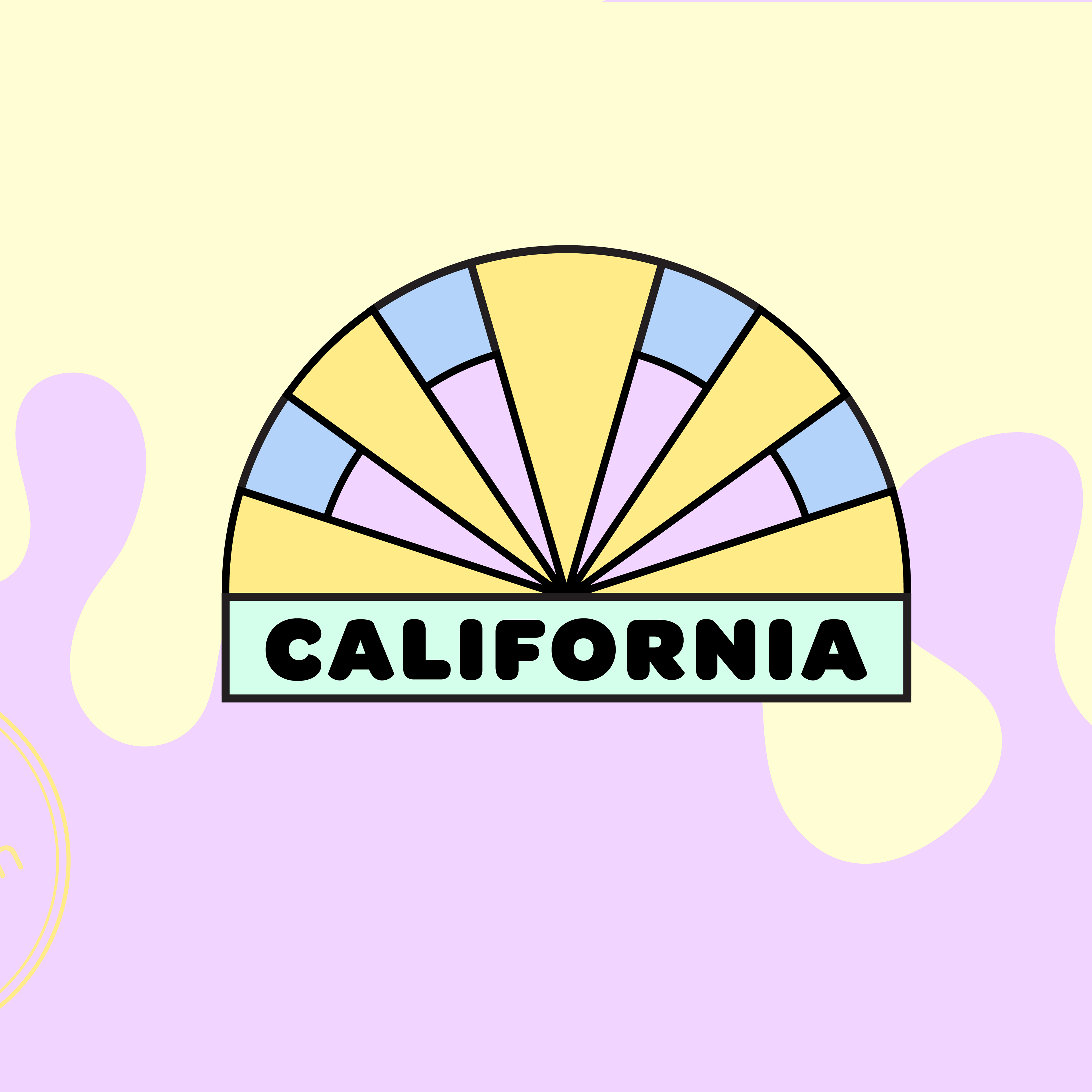
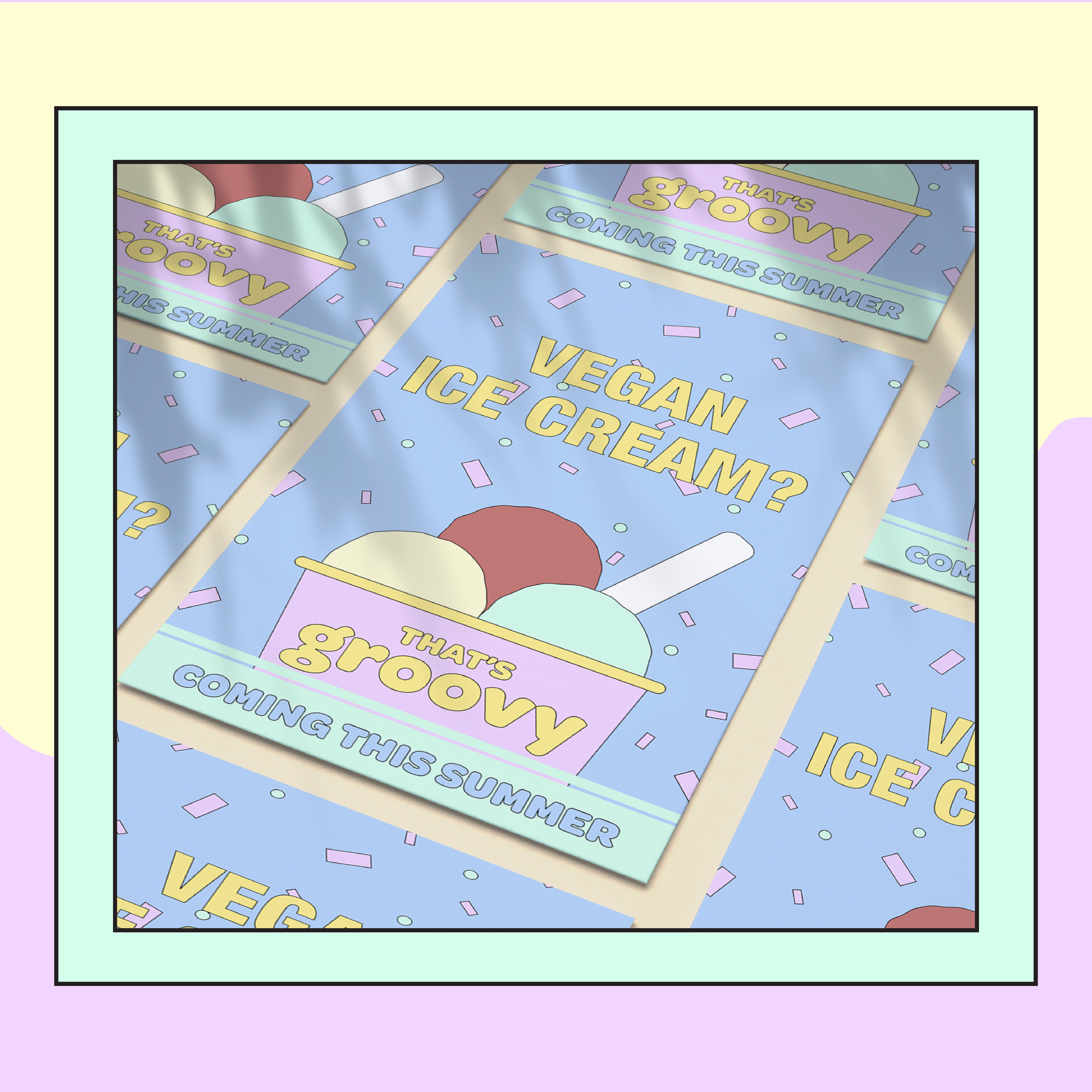
I wanted to capture the essence of California in this design to separate it from the market and give it a unique style and when scrolling through Pinterest, I saw that roller skating is popular there and obviously the palm trees are iconic so I had to incorporate them into my design.
Colour Scheme:
I chose a fun and playful colour scheme to match the image that comes to mind with a brand name like groovy. Colours that also could represent flavours or at least complement the flavours inside the tubs.
Typography Selection:
I chose to use font ‘OmnesCyrillic’ black as I felt it matched the vibe of the word groovy, giving an almost hippy / 60’s aesthetic
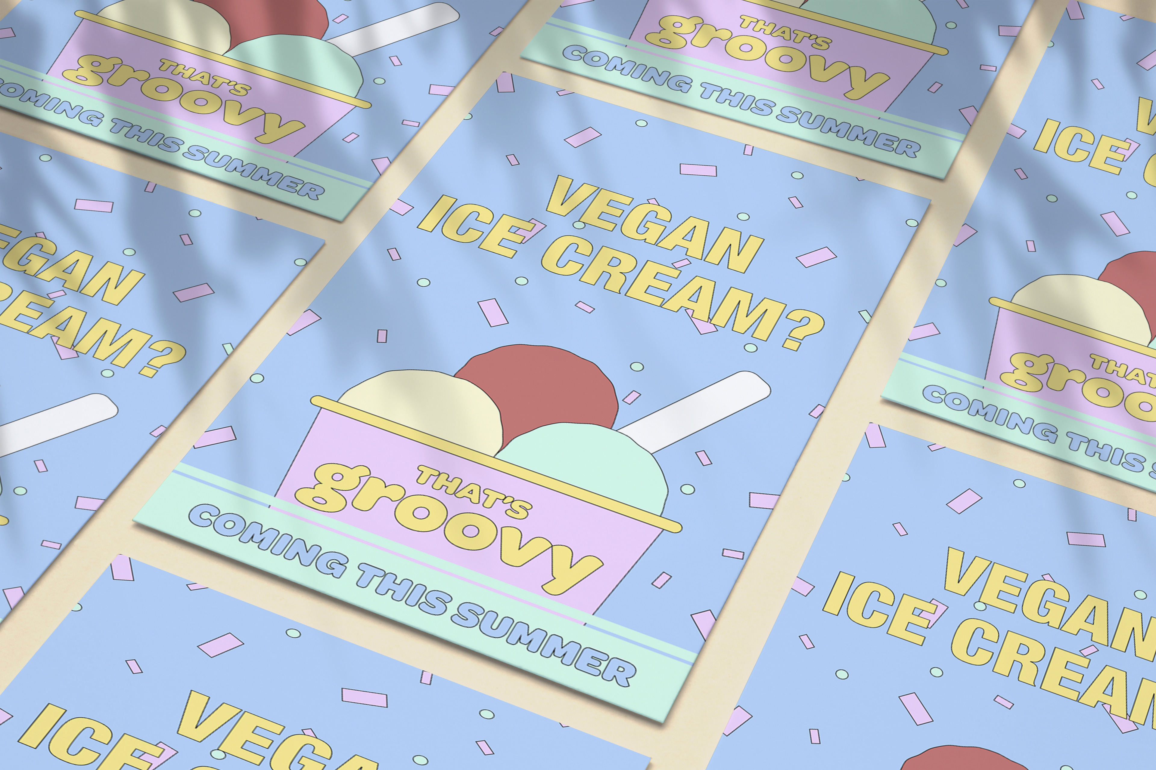