The Brief:
A small business that makes
delicious, colorful desserts
needs a branding package.


My Idea:
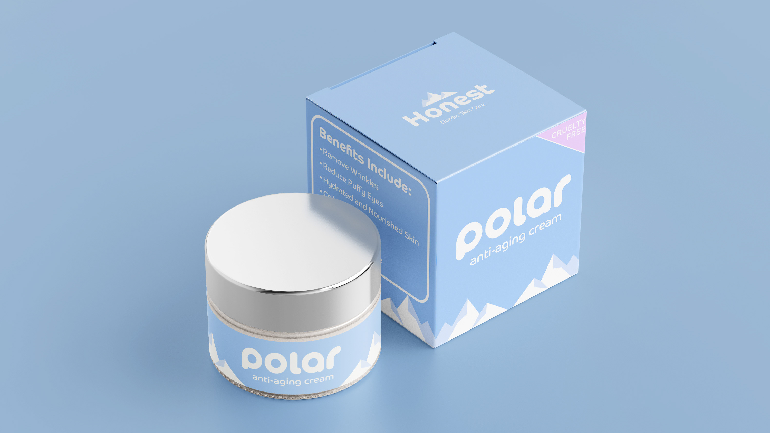
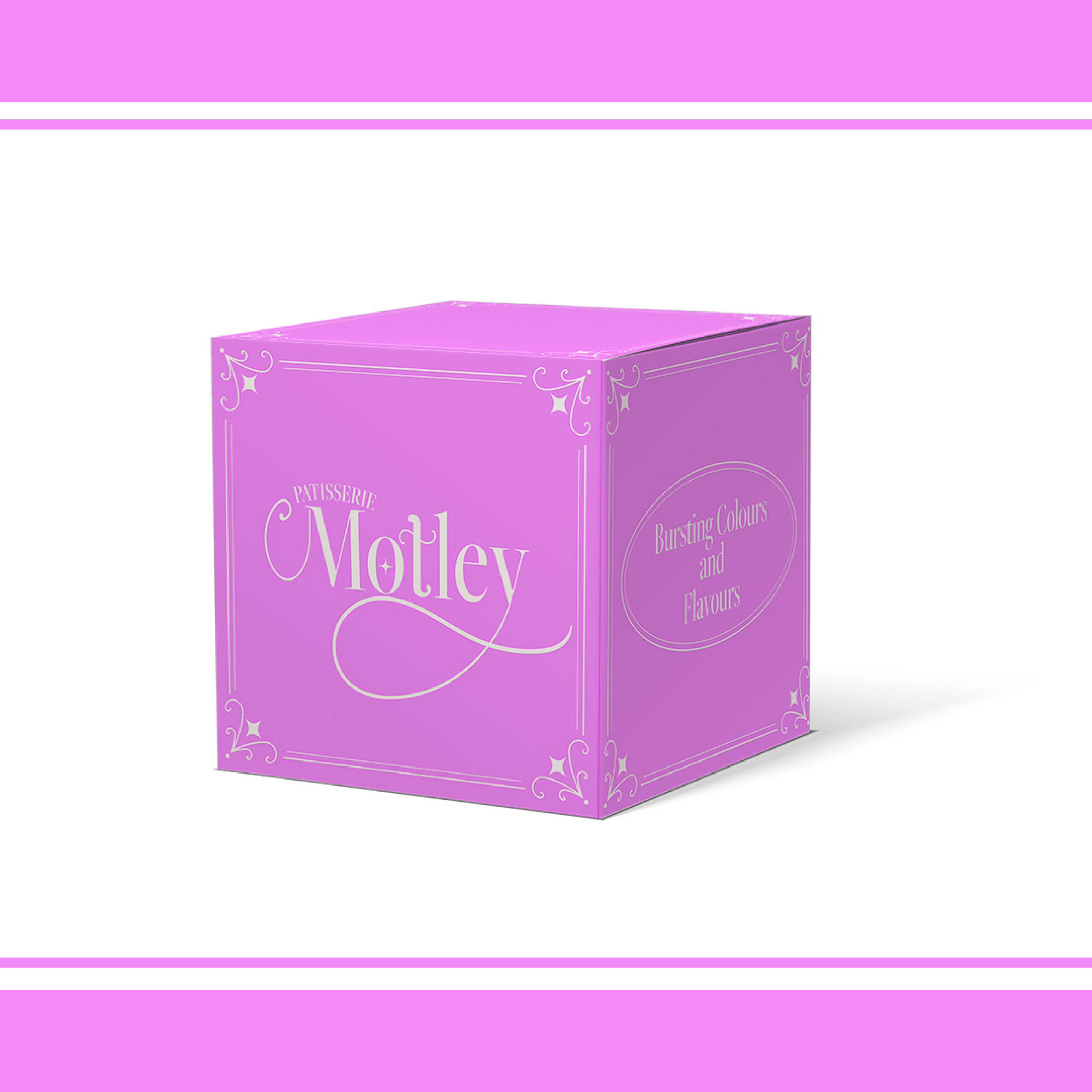
I wanted to show the fun, colourful and tasty side of the brand via its colour scheme, which I aimed to do via bold colours representing popular flavours in desserts as noted in my slide on colour theory.
I also wanted to portray a professional image via the type and display a hint of the history of bakery by using a serif style font that I customised to add a bit of fun back into it. I customised the letters M, T and Y in a swirly style to represent the type of decorating on cakes and the star feature in the O is another nod to the decorating.
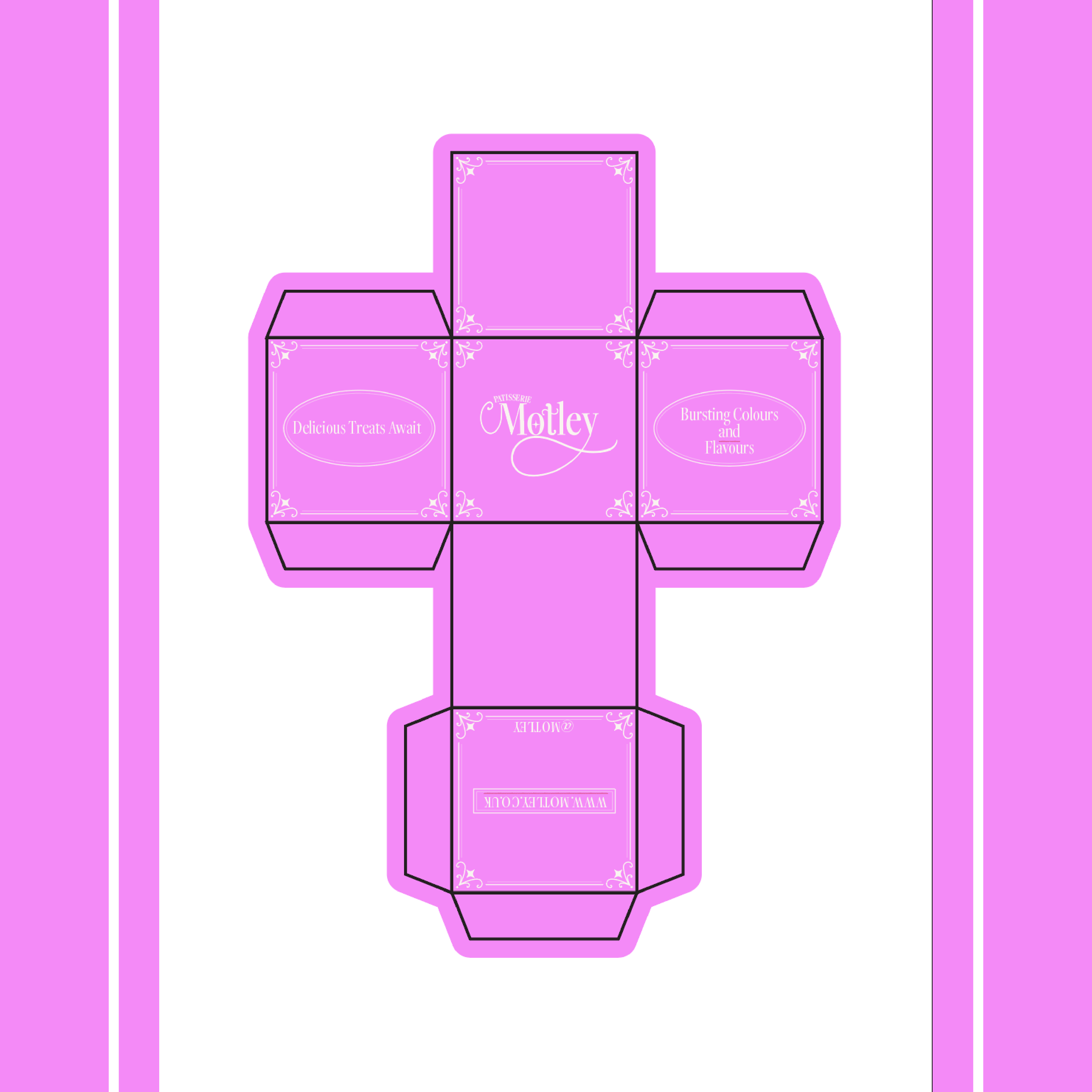
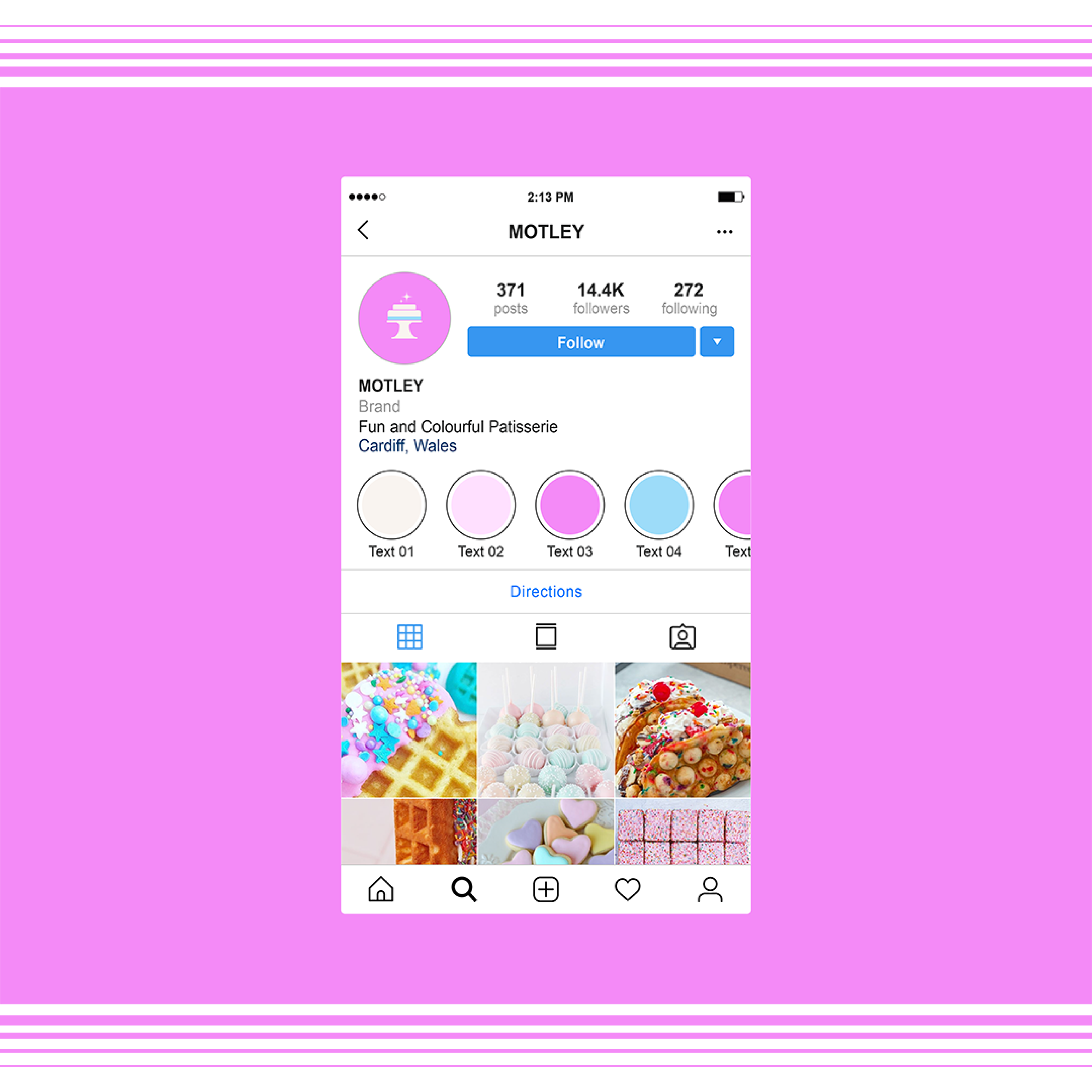
I went a couple steps further in this project to develop a secondary logo, an instagram page mockup and packaging mockup to fully display the potential of the project..
I wanted to show the fun, colourful and tasty side of the brand via its colour scheme, which I aimed to do via bold colours representing popular flavours in desserts as noted in my slide on colour theory.
I also wanted to portray a professional image via the type and display a hint of the history of bakery by using a serif style font that I customised to add a bit of fun back into it. I customised the letters M, T and Y in a swirly style to represent the type of decorating on cakes and the star feature in the O is another nod to the decorating.
I went a couple steps further in this project to develop a secondary logo, an instagram page mockup and packaging mockup to fully display the potential of the project..