The Brief:
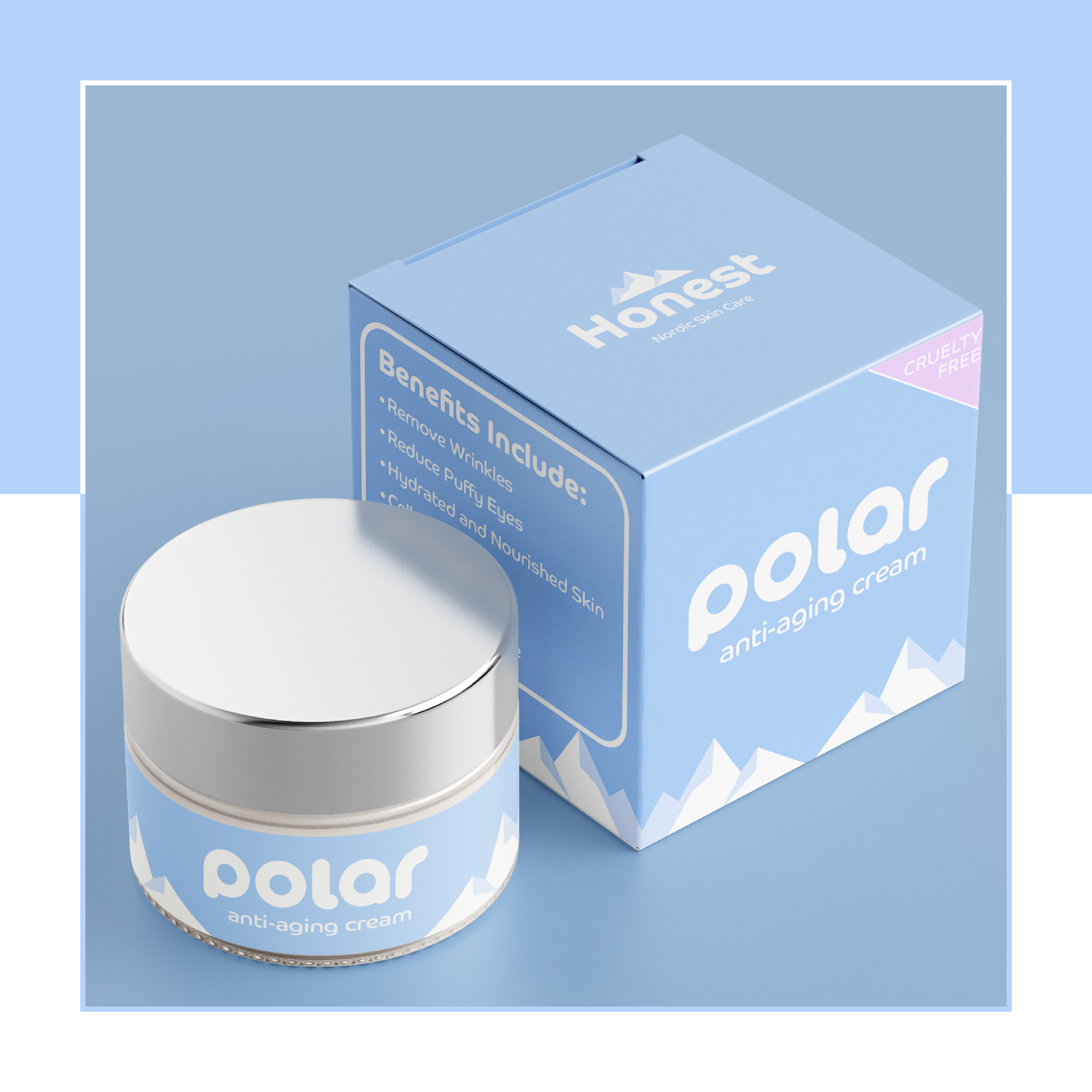
Polar is a Norwegian cosmetic company that sells day, night and anti aging cream. They are also a honest and cruelty free brand.
They required an eye catching logo and packaging.
They required an eye catching logo and packaging.
My Idea:
Colours - a combination to show honesty while also conjuring up the cold icy feeling the name polar gives. Plus there’s a connection between cold temperatures and how the skin reacts which I think a customer may subconsciously connect to in a positive manner.
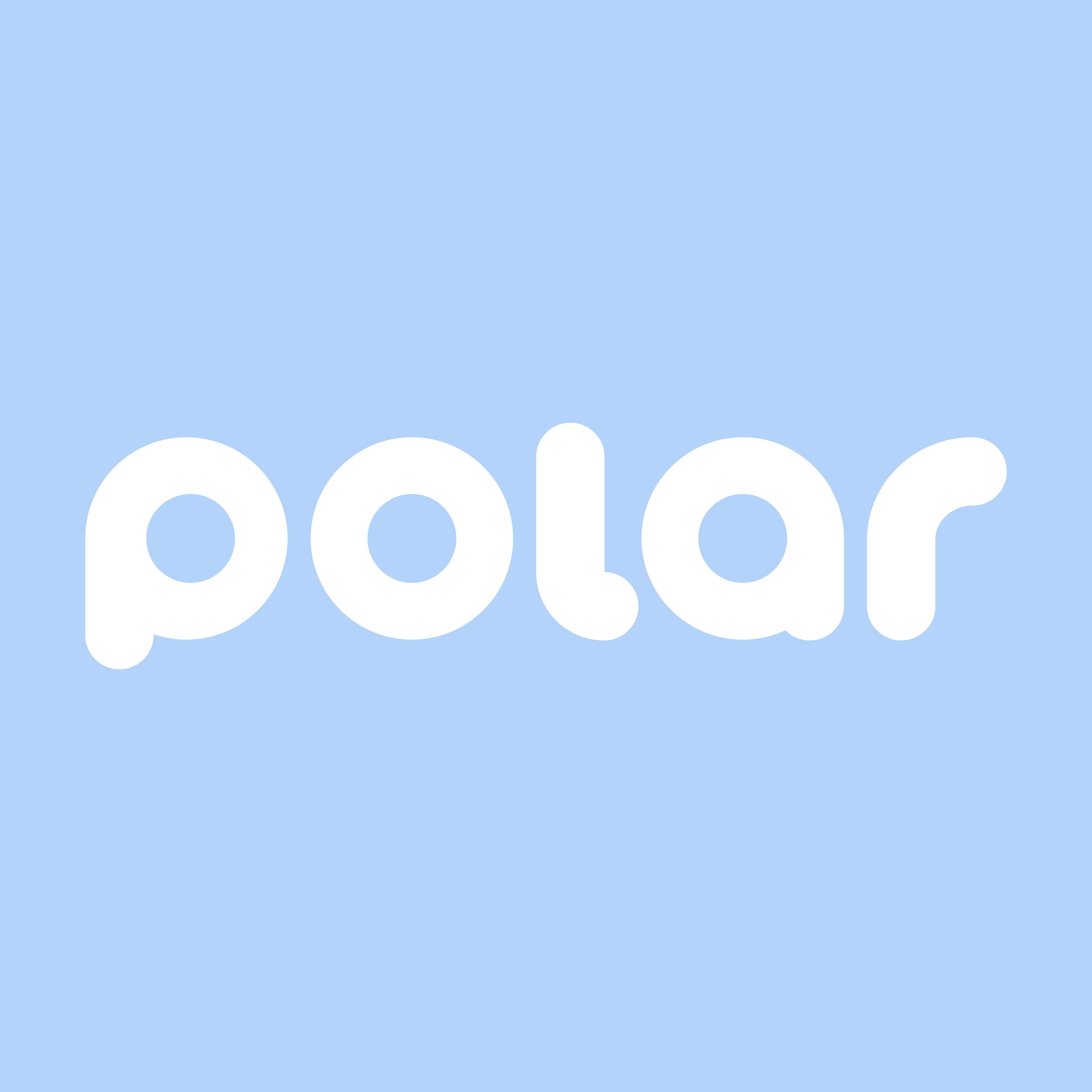
Typography - I wanted a fun and friendly looking font that would represent youthfulness and soft skin hence why it’s a round and bubbly font. This is also quite eye catching when pared next to existing products in the market who perhaps have a more serious tone.
Imagery - the icy mountain are there to reinforce the idea of cold temperatures and it pairs nicely with such a cold sounding name as polar.